Refining component search with library context in Figma
I was a product design intern on the Design Systems team at Figma, which was responsible for Figma's design systems features, like libraries, components, and styles.
Collaborators
Design mentor Engineer Product manager
Duration
Sep 2021 (3 weeks)
Released
Jan 2022
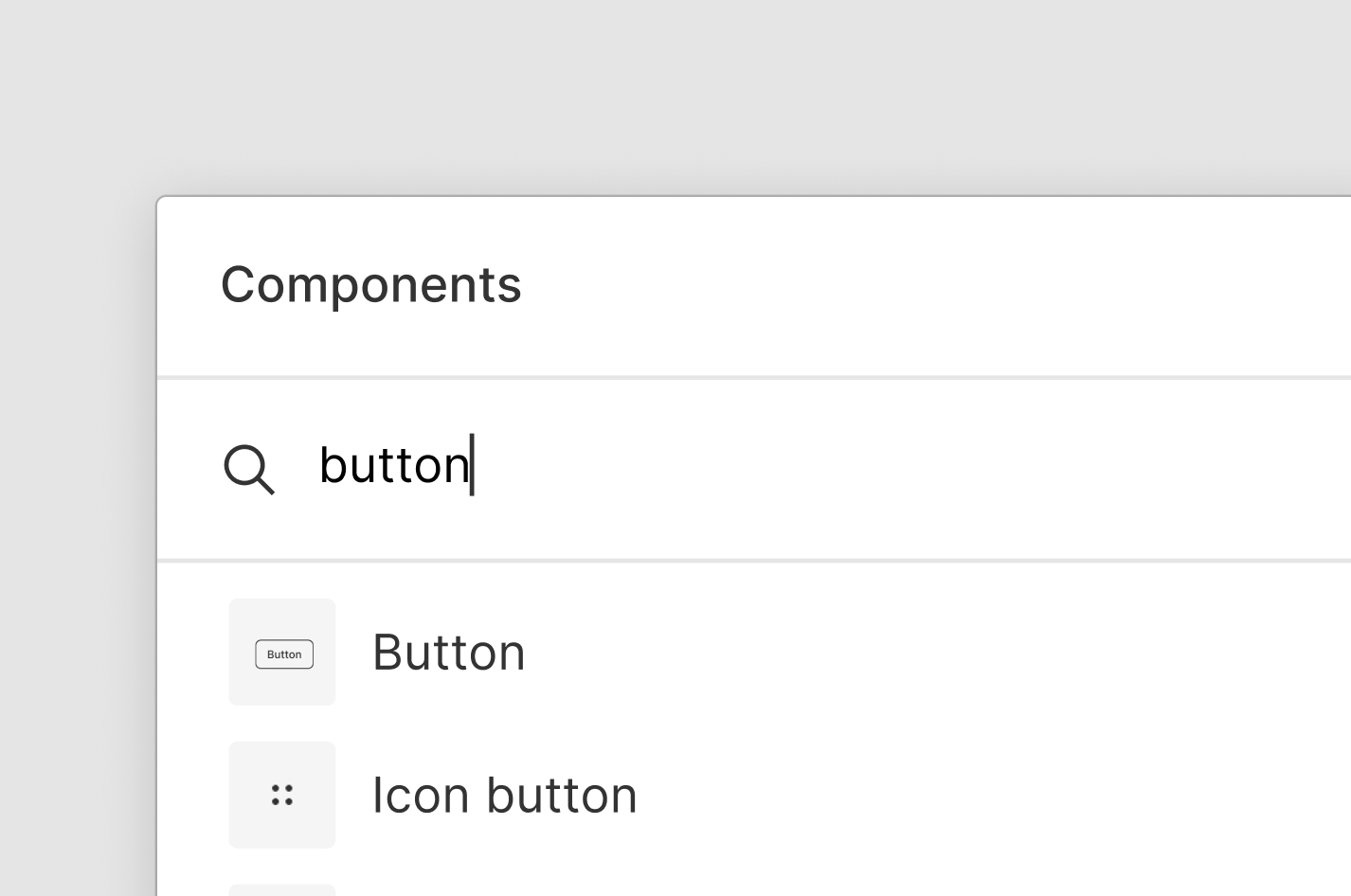
It is hard for people to find the components they’re looking for.
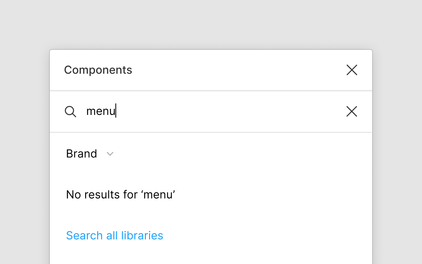
When a consumer—anyone who uses components—searches for a specific component in Figma, they aren’t always confident that they selected the right one. The search results don’t provide enough information to differentiate similar components.

The “Secondary button” components are hard to differentiate
To ensure they select the intended components, consumers often copy & paste them from the original library files. This workaround is tedious and time-consuming.
There is an opportunity here to improve the process of finding the right component from the component search menu.
How might we help consumers find components more efficiently?
Measuring efficiency
Since this project was of a smaller scale, I used prior research and design critiques to guide my design decisions. Public feedback would be used later to gauge the success of the design.
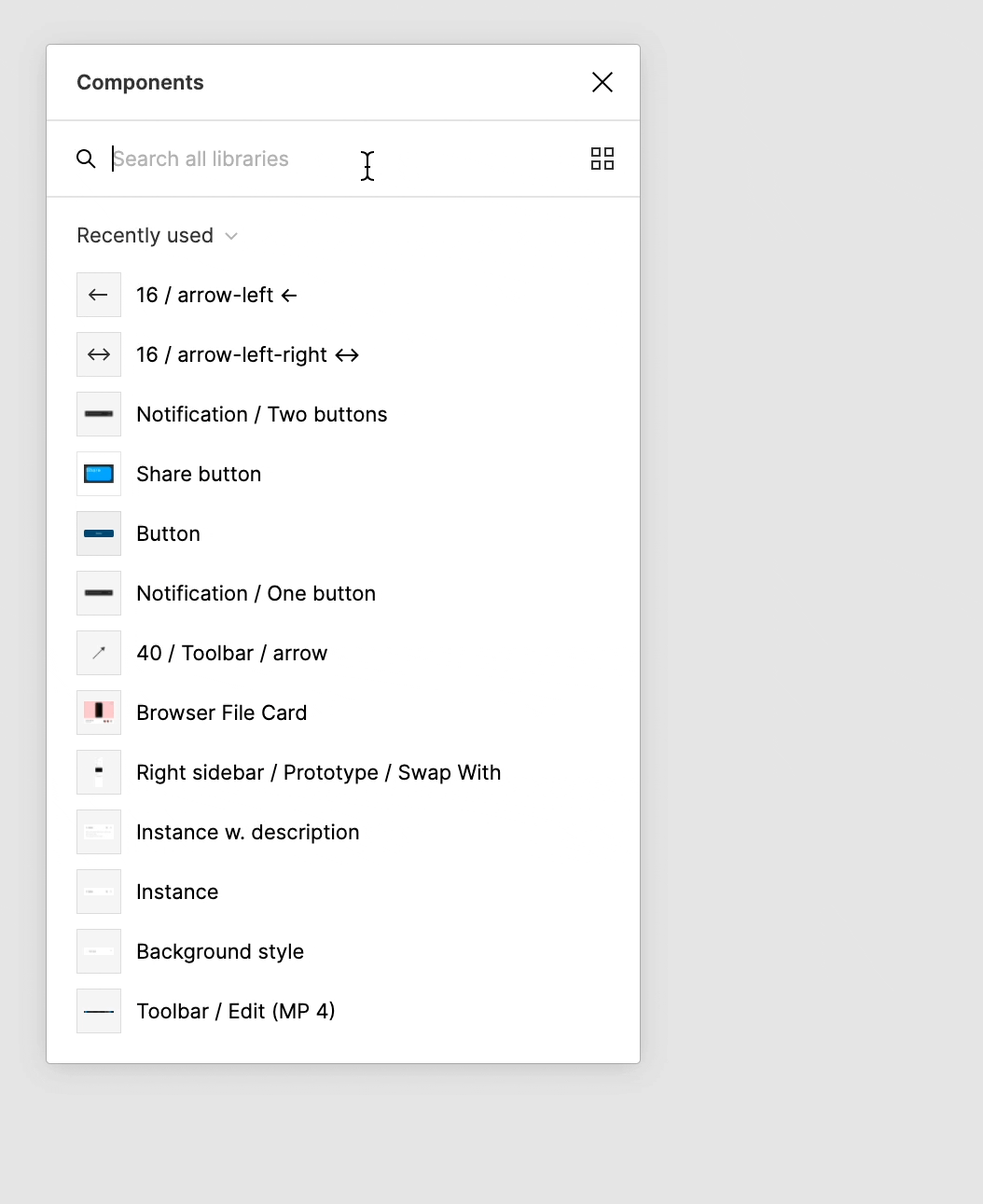
Separating components by library
Previous research indicated that consumers differentiated similar components by libraries. Based on this insight, my main approach was to clarify which library each component belonged to.
Two methods that could achieve this objective are:
1 / Labeling each component 2 / Grouping components by library

Option 1: Label components

Option 2: Group components ★
I generated multiple designs for both options and selected grouping components as the better option.
The component search menu has the option to display components in either a list or a grid format, so I needed a solution for both views. Although labels make it easy to compare similar components, structural differences prevented a clean solution that worked for both the list and grid.
Grouping by library works for both views, follows existing component organization patterns, and better matches consumers’ mental model of the library-component relationship.
I presented two main options: listing and filtering.
Incorporating feedback on grouping
Feedback from a design crit session centered around engineering feasibility. Considering the search result ranking algorithm and the variable number of components in each library, filtering was the more promising choice. This option was the simplest engineering-wise while still providing value of helping people find components more quickly.
Option 1: List
Option 2: Filter ★
Diving deeper into filtering interactions
Now that I was confident in the general direction of filtering, I iterated on different ways to filter search results by library.
Most of these options involved adding something new to the component search menu. My design mentor challenged me to simplify the solution even further, which led me to play around with the existing components—specifically, the library dropdown.

Several filtering iterations
Simplifying with a functional change
I landed on changing the existing functionality of the library dropdown.

Flow for changing library during a search
Originally, the search bar searched through everything regardless of the library selected in the dropdown. Narrowing the search scope to the selected library instead would decrease the search time while keeping the interface simple.
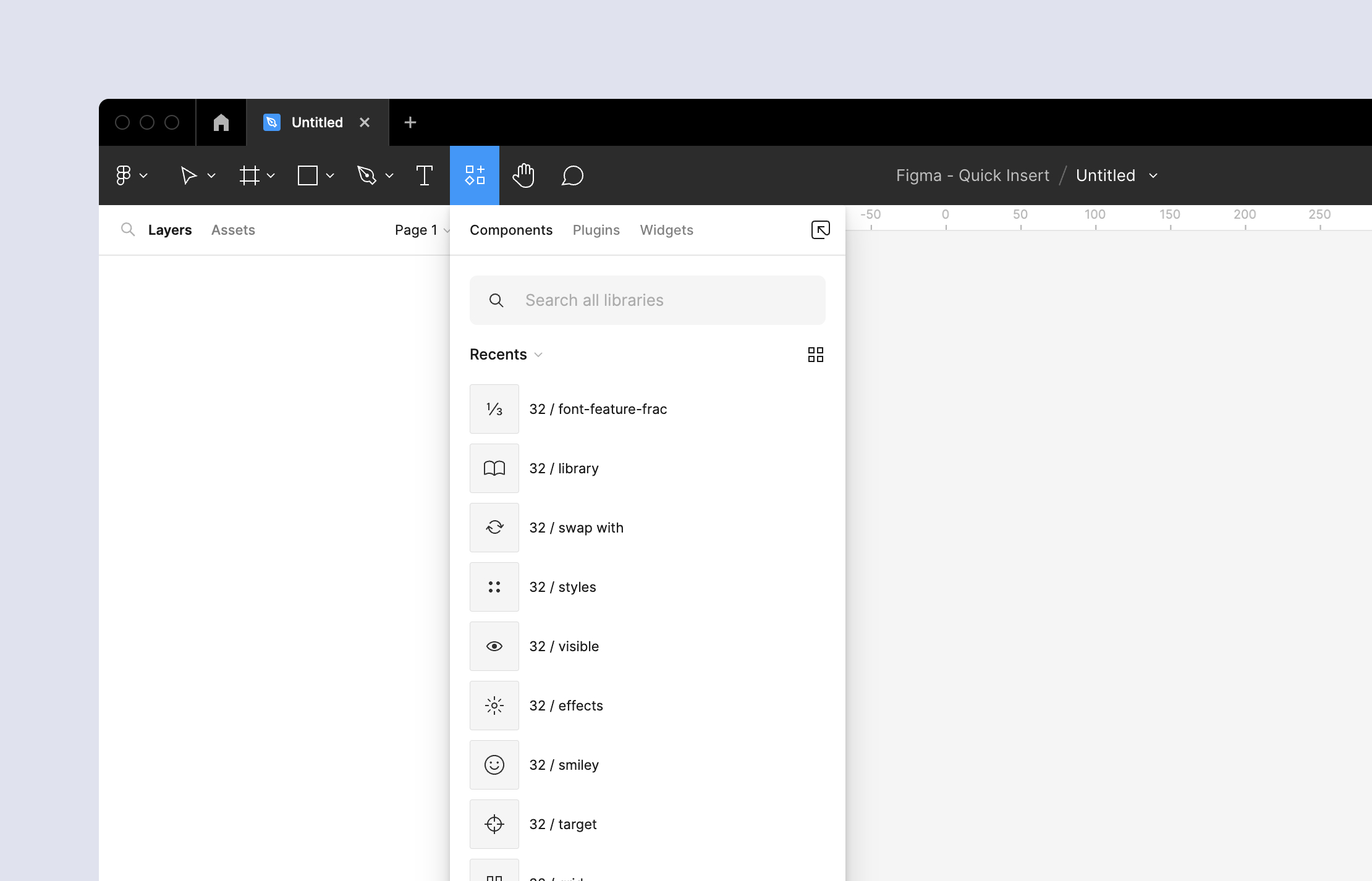
The final design has four features that express this new functional change.
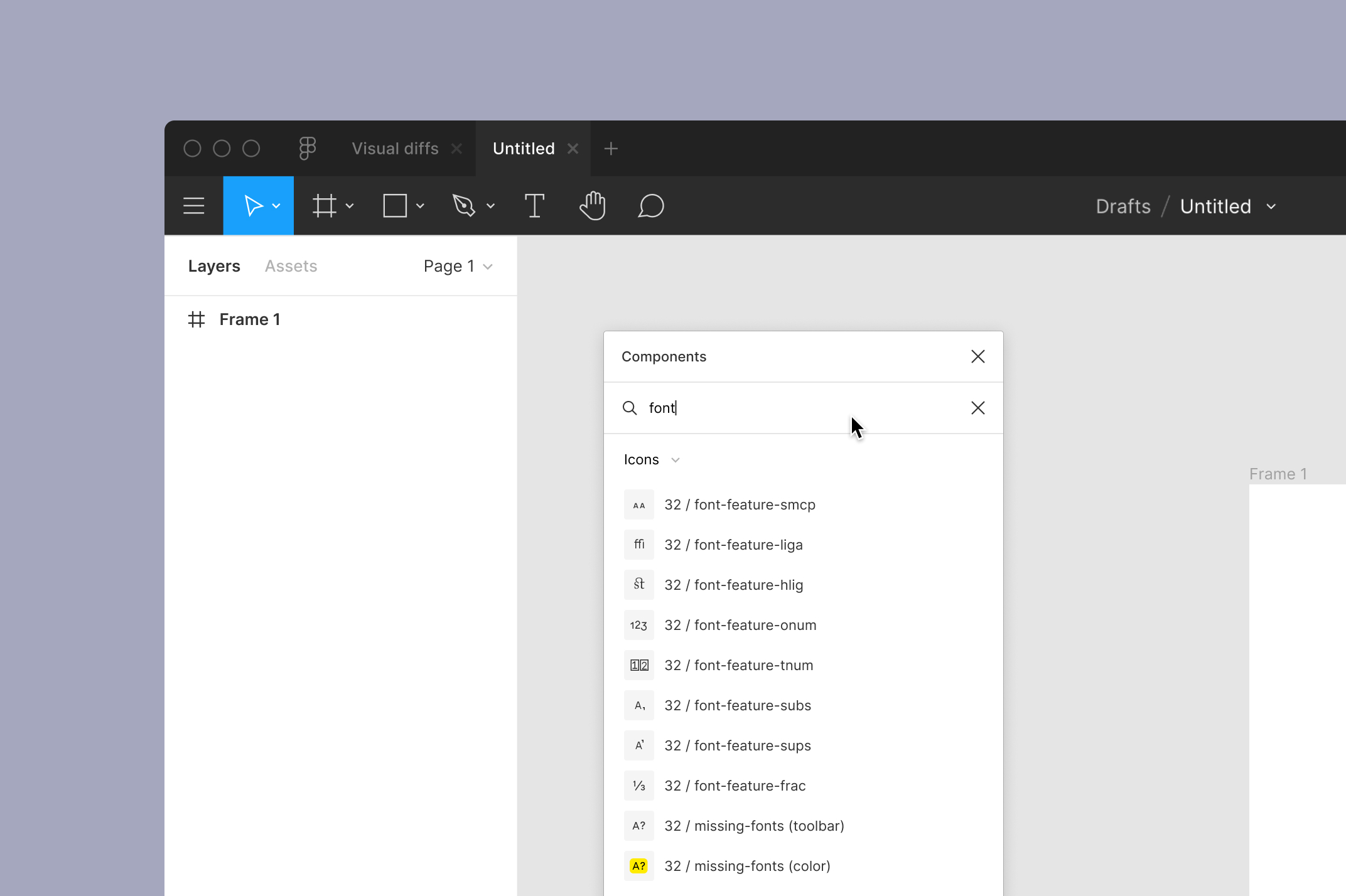
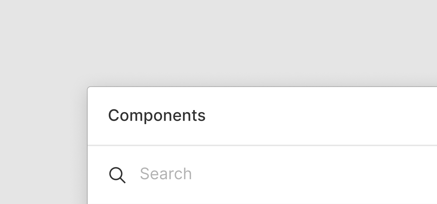
1 / Helper text
The search bar helper text now reflects the scope of the search, signaling the possibility to change it.
Original
Redesign
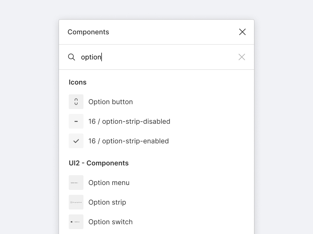
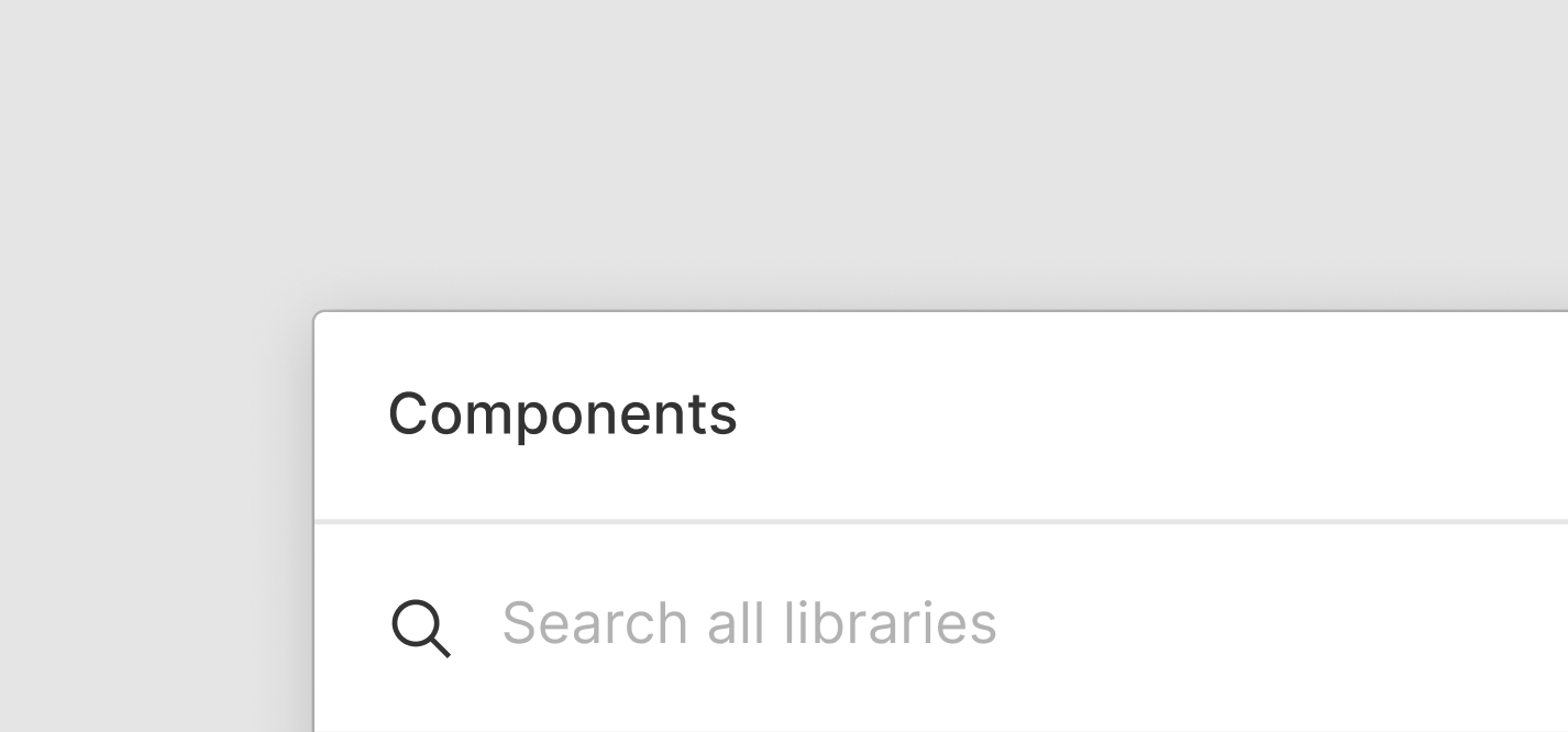
2 / Visible search scope
Searching automatically shows the library name in the dropdown to clarify the search range. Its visibility while searching also allows consumers to change libraries quickly.
Original

Redesign
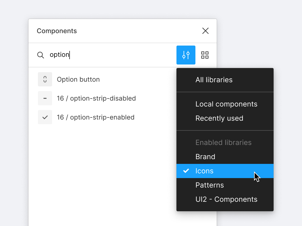
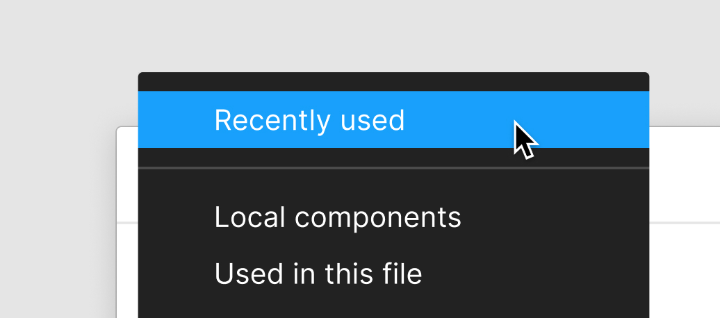
3 / Combining Recently used with All libraries
Since “Recently used” is the default library and has only ~20 components at most, we kept the ability to search all libraries as the default. This baseline makes finding a component faster by not limiting the initial search to a small library. To make this functionality explicit, “Recently used” changes to “All libraries” when changing the library in the middle of a search.
Original

Redesign
4 / Search all libraries
If a consumer is looking for another component in a different library, there is now a quick way to expand the search range through the “Search all libraries” button.

Original
Redesign
Bringing the four features together.
These additions will help consumers search for components more efficiently.
The final design
Results
Since this redesign was released after my internship ended, I did not have access to internally-collected feedback. However, several positive comments about the changes on SNS were early indicators of success for the design.
A step towards a bigger goal
My project was a building block for a more ambitious plan to unify search in Figma. Its structure laid part of the foundation for universal search in the new Resources tab.
Component search, as of June 2022.
Asking the right questions and iterating often
Through this project, I learned that sometimes the best solution involves barely any visual changes at all. But it can take a lot of iterations to get there! Learning to frame the problem and ask the right questions at the beginning helped me get to the final stage with more confidence.